CORPORATE IDENTITY
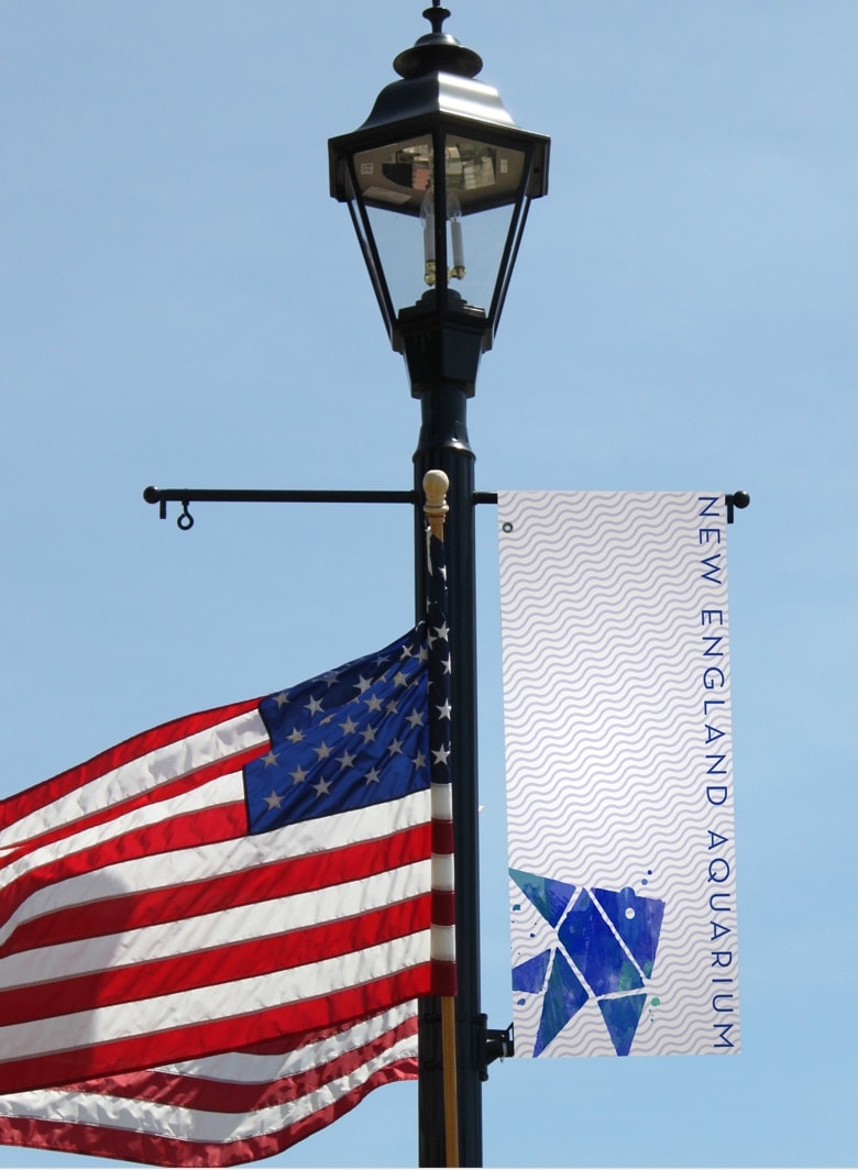
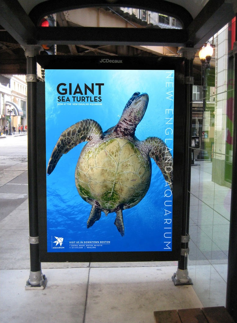
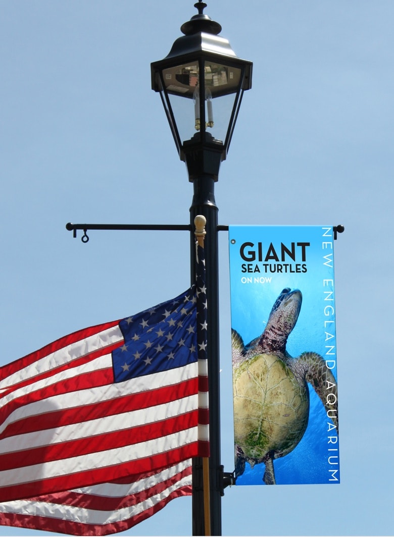
The New England Aquarium corporate identity is a visual system that reflects the diversity and energy of both the organization and its marine life. In addition to being a leading Boston tourist attracting, the aquarium works extensively in the fields of conservation, research, and education.
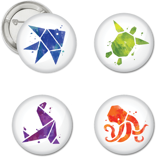
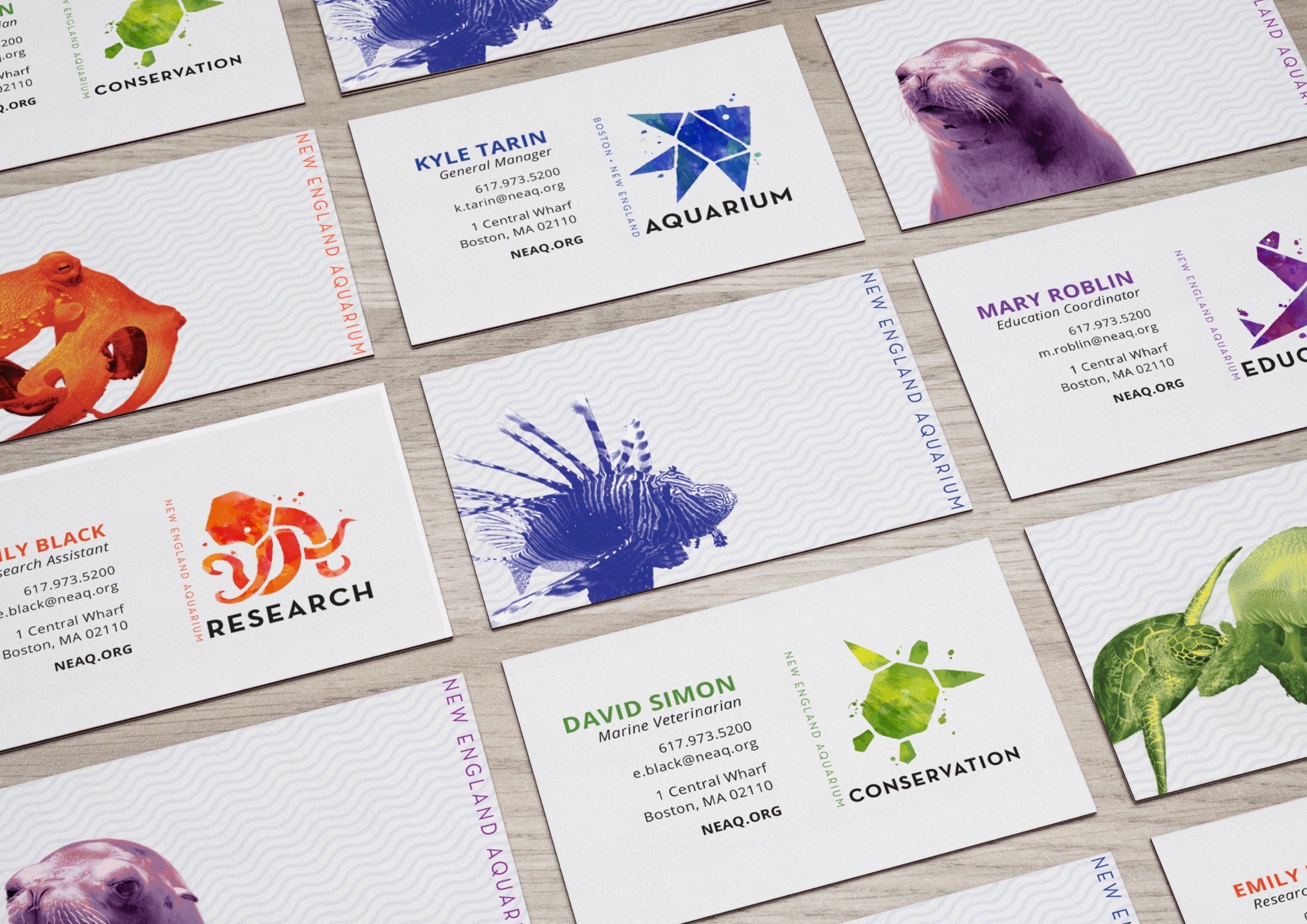
Just as the vast diversity of marine life works together to create one balanced ecosystem, so do the different branches of the aquarium. This unity is represented through geometric shapes coming together to form the logos of the branches. Each branch is takes on a different sea creature that represents the work they do. The identity also incorporates the spirited work of the aquarium through the use of bright active colors and textures.
CONCEPT DEVELOPMENT
FINAL LOGO DESIGNS
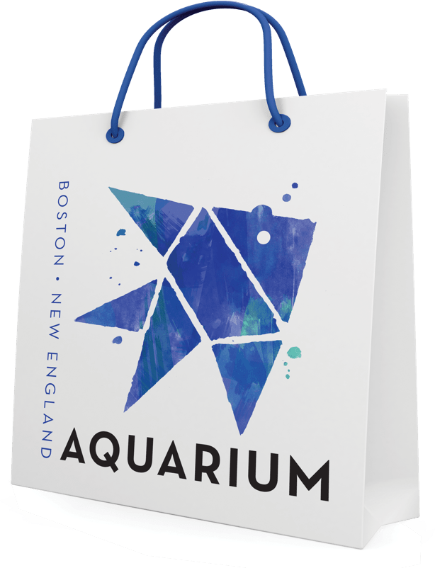
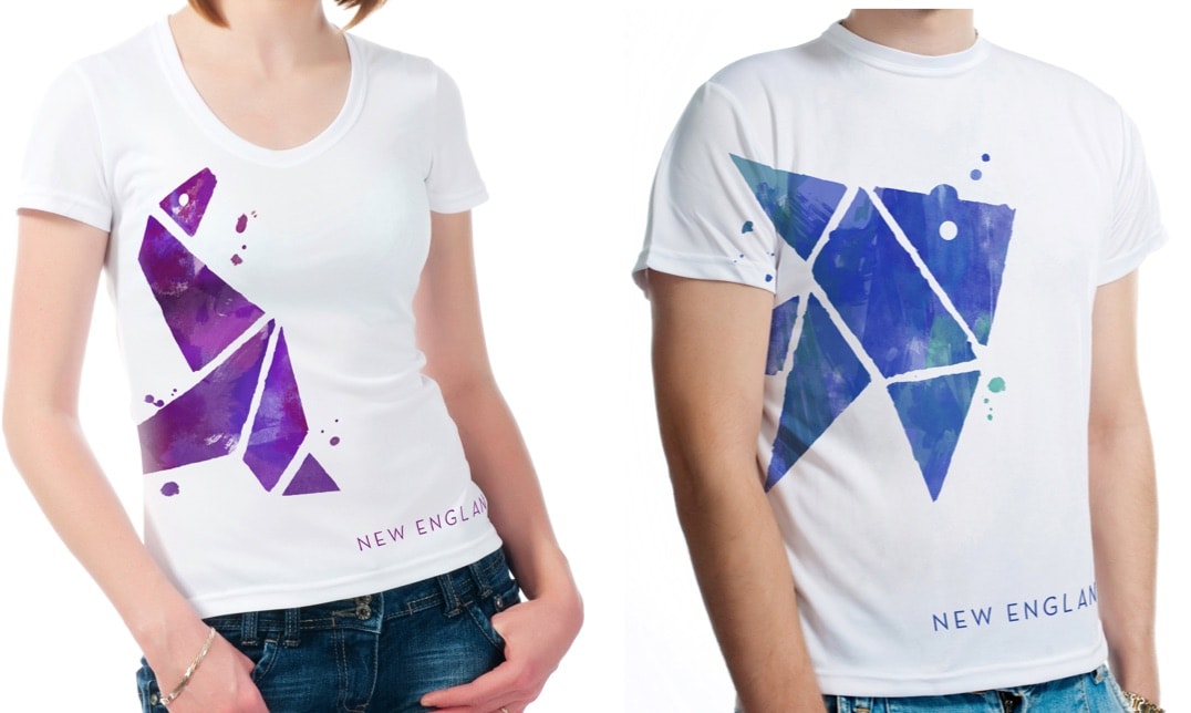
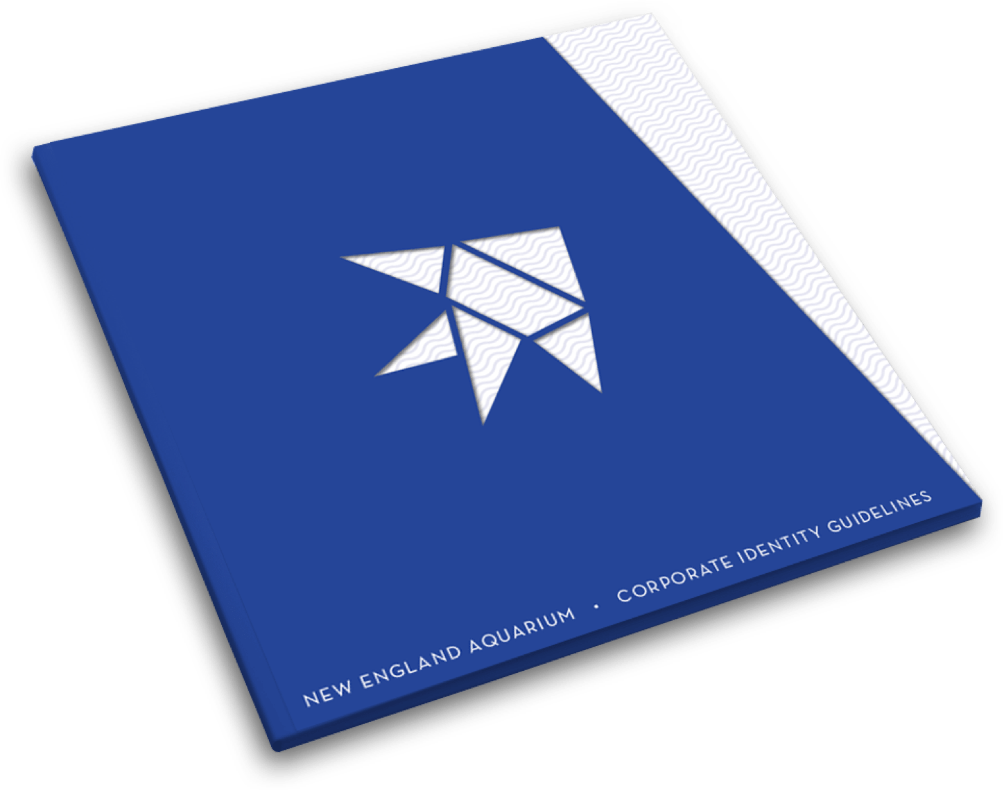
The fish is the general logo for the aquarium, being the animal most commonly associated with aquariums and marine life.
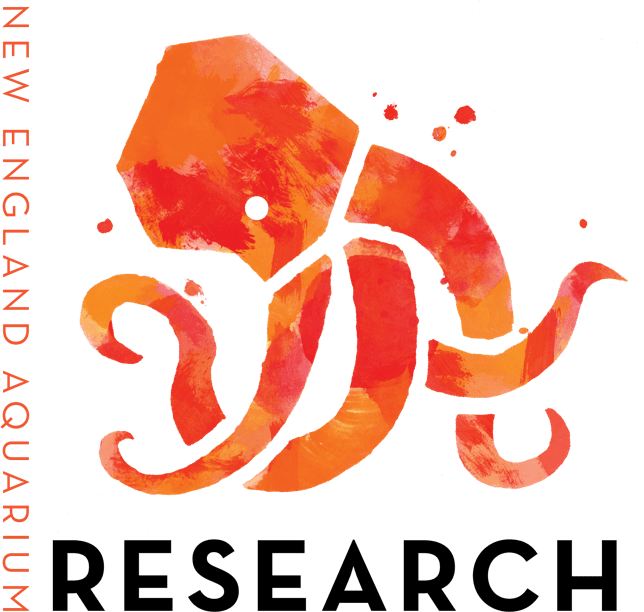
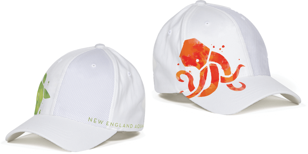
With its many arms, high degree of intelligence, and curious nature, the octopus represents the research branch of the aquarium.
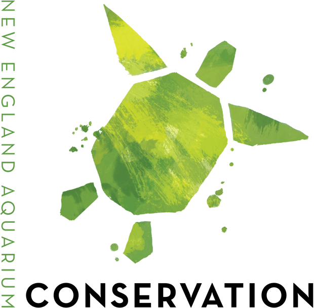
In aboriginal mythology, the world was carried on the back of a giant turtle. With its hard protective shell, the sea turtle is the perfect animal to represent the conservation branch.

The seal is a caring social mammal with a strong family structure. As such it is an appropriate animal to represent the education branch.
PROMOTIONS AND MERCHANDICE
