DESIGN AGENCY
Propeller was founded in 2011. As the studio grew in size and talent, we transitioned from a focus on branding, print and website projects for small businesses into large scale digital product, both for large corporations and proprietary. The identity of our studio began to outgrow our visual branding and it was time for a refresh.
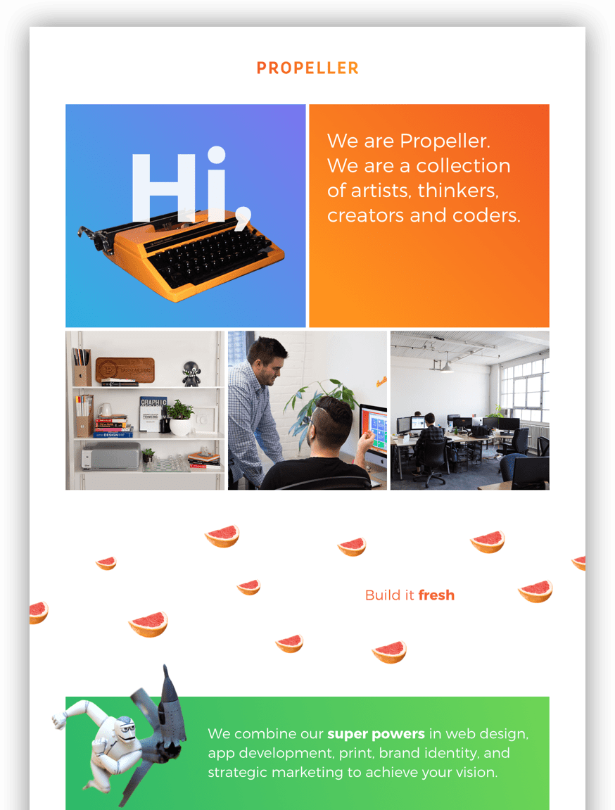
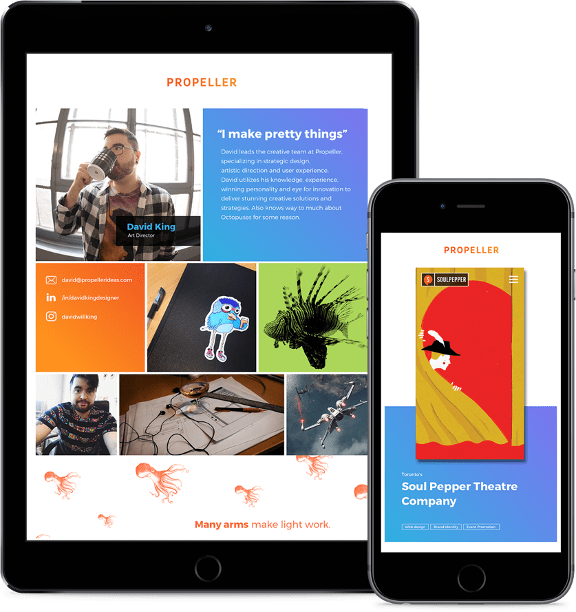
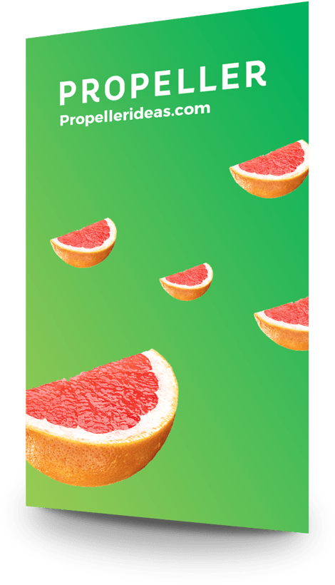
The goal was to create a visual identity that reflected Propeller’s creativity, high-tech capabilities, and above all else, that captured the unique personality of our team, which we saw as our greatest strength. This was accomplished through simple bright colour, complemented by photos of artifacts from around the studio and imagery that represented us.
ORIGINAL LOGO
The original logo had a handmade vibe, which no longer reflected the cutting-edge interactive products being produced at Propeller. |
|
The original logo consisted of fine detail and line work. This complicated the logo causing problems when printed or rendered at small scales. |
|
The red and black colours made the logo heavy and dark which did not reflect the personality of Propeller. |
REFRESHED LOGO
The redesigned logo is more modern. It's clean, simple and efficient which better reflects values and type of work Propeller does. |
|
The new logo eliminated the excessive details and line work, reducing the logo to its purest form while maintaining a familiarity to the original. |
|
The bright colours and subtle gradients better reflect the fun, creative energy of Propeller. |
TYPOGRAPHY
COLOURS
ORANGE light: #FF931E dark: #F15C24 |
|
BLUE dark: #7B75EF light: #2FB2E0 |
|
GREEN dark: #2EB96A light: #6DD555 |
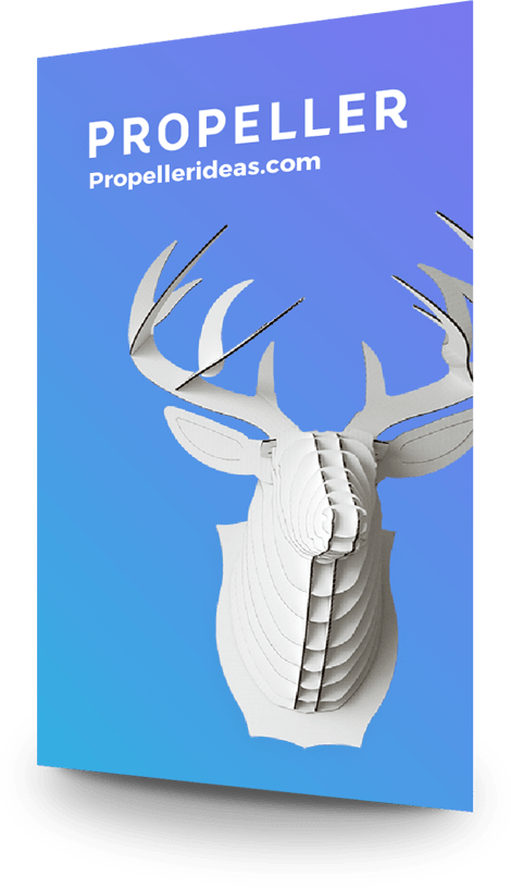
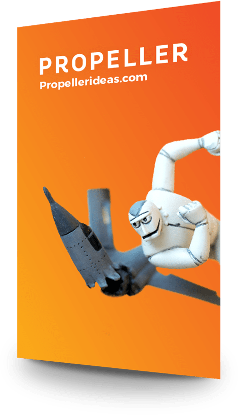
BUSINESS CARDS
The website was the centrepiece of the update. We defined our people and unique approach as the primary asset of the agency, even more so than the work we have produced in the past. So we decided that we, and not our portfolio, should be the focal point of the site. This drove us to populate the site with personal images, studio artifacts, fun quotes, and “real-sounding-conversational” copy all of which reflected us. And of course, we included our portfolio.
